
Use radar chart to present company’s performance

Highlights
- Difficulty:★★☆☆☆
- Construct radar chart step by step
- Advice: This article converts several important financial indicators to percentiles for the sake of radar chart that summarizes firm’s performance. Since we use lots of financial data that comes from TEJ API database, so for those who aren’t familiar with the process of getting data from financial database, it’s recommended to read 【Introduction(6)】- Obtain Financial Data first before starting to build your own radar chart !
Preface
Dashboard is a simple page that coveys valuable information with proper visualization and informative chart. The users can quickly identify a certain trend or make some inferences. Therefore, a well-designed dashboard not only requires simple and clean user interface, but also has to reveal the most important value in the most precise way, instead of making users even more confused.
Radar chart is a common chart on a dashboard and a technique to analyze the financial statement. By comparing different periods or peers firms’ performance, we can know more about the changes or the relative performance of the target’s firm. In other words, it’s useful for fundamental analysis.
The Editing Environment and Modules Required
Windows OS and Jupyter Notebook
#basic
import pandas as pd
import numpy as np#graphy
import plotly.graph_objects as go#TEJ API
import tejapi
tejapi.ApiConfig.api_key = 'Your Key'
tejapi.ApiConfig.ignoretz = True
Database
- IFRS Financial Report (Cumulative): the code of the database is “TWN/AIMIA”, covering cumulative financial data of listed firms
- Fundamentals: the code of the database is “TWN/AIND”, containing basic information such as the firm’s industry, employees, listed date and so on
Data Processing
Step 1. Obtain financial data
database = tejapi.get('TWN/AIM1A',
                    mdate = {'gte':'2020-01-01'},
                    paginate = True,
                    opts = {'pivot':True, 'columns': ['coid','mdate','4151','R106','R502', 'R503', 'R509', 'R631', 'K632', 'R103']},
                    chinese_column_name = True)
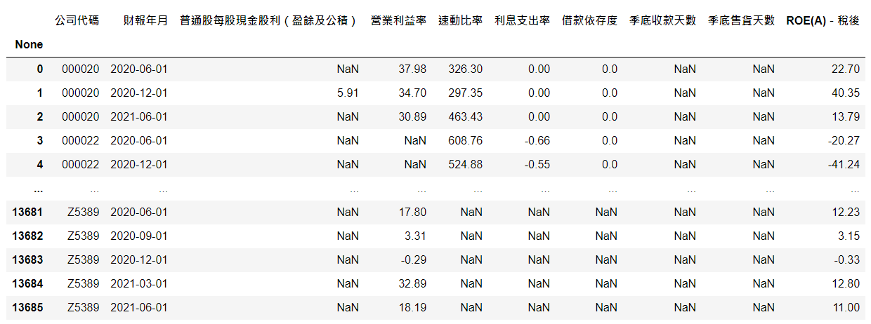
Here we obtain the data of all firms since 2020 from TEJ financial database. And the columns include cash dividend, operating profit ratio, quick ratio, interest expense rate, debt/equity ratio, days’ sales in account receivable, days’ sales in inventory and ROE
Step 2. Cash dividend
dps_date = database[database['財報年月'].dt.month == 12].groupby(by = '公司代碼').last()['財報年月'].mode().values[0]
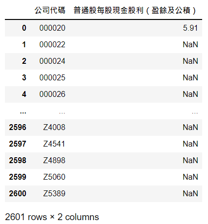
Because cash dividend is annual data, it can only be seen in December. Then we use groupby to divide data by firm and the last observation in each group is the latest observation. To avoid the situation where some firms disclose financial reports ahead of others, and there are still few comparable firms, we adopt [‘財報年月’].modeto choose the major latest date as our base date

dps_radar= database[database['財報年月'] == dps_date].loc[:,['公司代碼','普通股每股現金股利(盈餘及公積)']].reset_index(drop=True)
Then with this date, select cash dividend of all firms in 2020
Step 3. Process data with seasonal frequency
database = database.drop(axis =1, columns = '普通股每股現金股利(盈餘及公積)')
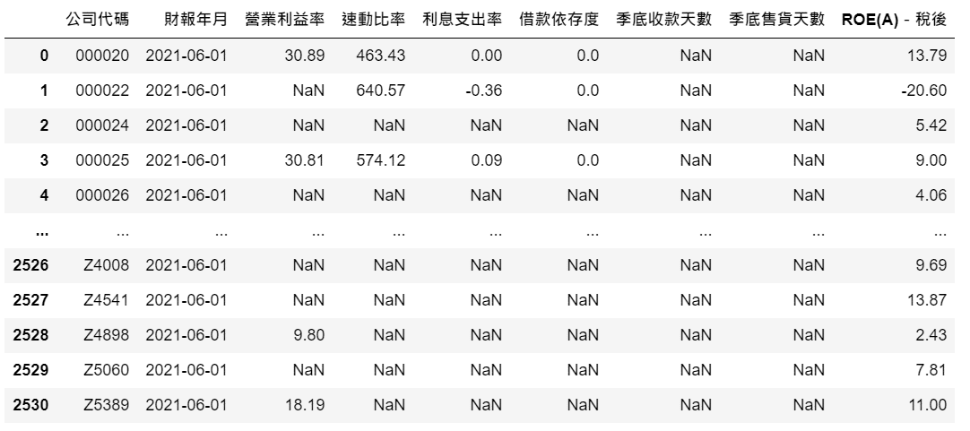
com_date = database.groupby(by = '公司代碼').last()['財報年月'].mode().values[0]
adj_radar = database[database['財報年月'] == com_date].reset_index(drop=True)
Remove cash dividend columns first and filter the data by the base date as we did in Step2
Step 4. Combine and scale data
adj_radar = adj_radar.merge(dps_radar, on = '公司代碼')
adj_radar = adj_radar.dropna().reset_index(drop=True)
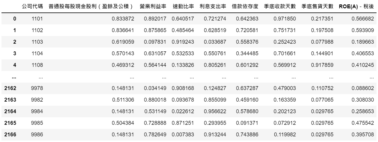
ranked_radar = adj_radar.loc[:, ['普通股每股現金股利(盈餘及公積)', '營業利益率','速動比率','利息支出率','借款依存度','季底收款天數','季底售貨天數','ROE(A)-稅後']].rank(pct=True)
ranked_radar.insert(0, '公司代碼', adj_radar['公司代碼'])
First of all, we combine all the financial data and drop the observation with missing value. Then use rank(pct=True)to convert all values into percentiles. For instance, if five firms have cash dividend 1, 2.5, 3.3, 4.2, 35 respectively, after transformation, the values become 0.2, 0.4, 0.6, 0.8, 1. Lastly, we insert firm column by using insert
Visualization
Step 1. Choose a firm and see its performance
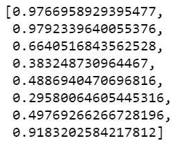
firm_radar_list = ranked_radar[ranked_radar['公司代碼'] == '2330'].iloc[0, 1:].tolist()
Here we choose Taiwan Semiconductor Manufacturing Co. (2330) as our example, and store its scaled information in a list
firms = tejapi.get('TWN/AIND',
                  paginate = True,
                  opts = {'columns':['coid','tejind2_c']},
                  chinese_column_name = True)industry = firms[firms['公司簡稱'] == '2330'].iloc[0,1]
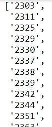
peers = firms[firms['TEJ產業名'] == industry]['公司簡稱'].tolist()
Then from the TEJ database, obtain TSMC’s industry category industry, which is used to select the codes of all peer firms peers
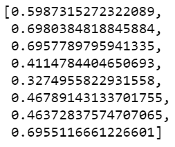
industry_radar = ranked_radar[ranked_radar['公司代碼'].isin(peers)].loc[:, ['普通股每股現金股利(盈餘及公積)', '營業利益率','速動比率','利息支出率','借款依存度','季底收款天數','季底售貨天數','ROE(A)-稅後']].mean()
industry_radar_list = industry_radar.tolist()
Next, calculate the average percentile of peers firm as the overall performance of the industry
Step 2. Draw radar chart
categories = ['現金股利','營業利益率','速動比率', '利息支出率','借款依存度', '收款天數', '售貨天數', 'ROE']fig = go.Figure()fig.add_trace(go.Scatterpolar( r= firm_radar_list,
                           theta= categories,
                            fill='toself',
                            name='公司'))
fig.add_trace(go.Scatterpolar( r=industry_radar_list,
                           theta=categories,
                            fill='toself',
                            name='產業'))fig.show()
First we define catogories, which contains names of financial data that correspond to the values in firm_radar_listand industry_radar_list . And we fill the chart with color by toself
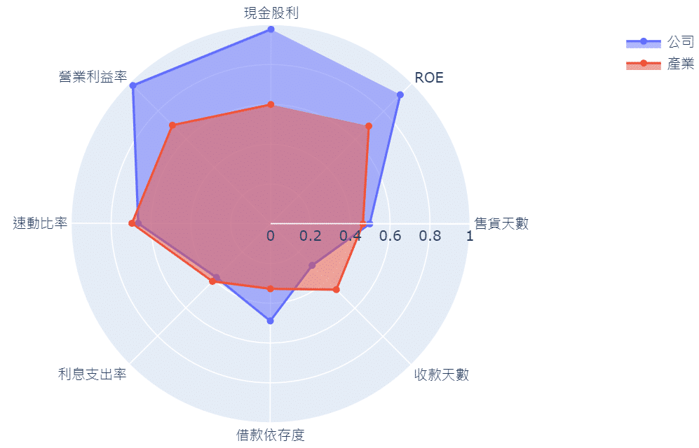
With the radar chart, we can have valuable information and insights immediately. First, the overall performance of semiconductor industry. Second, TSMC performs better in their operating profit ratio, cash dividend, ROE and days’ sales in account receivables compared to other firms in the same industry. However, its debt/equity ratio is higher that the average.
Conclusion
With TEJ financial database, we can build our own radar chart. And the selection of key financial data, ways of standardization, the definition of industry categories can vary according to your preferences. Although this article compares firm’s performance against peer firms in the same period, readers can also try to calculate a firm’s performance in different periods to see its change in recent periods. By this radar chart, we can evaluate a firm from a big picture perspective. If readers want to know more details in financial reports, we recommend the course held by TibaMe and TEJ to enhance your ability to analyze a firm. And if readers are interested in the databases used in the article, welcome to TEJ E-Shop to find the plan you like, then you can start to build your dashboard on your own!